Design a Flat Nav System
Most SaaS navigation isn’t designed. It accumulates. A sidebar gets bolted on in the MVP, a few items get added as features ship, and by year two nobody remembers deciding the structure — they’re just afraid to touch it.
The fix isn’t more nav. It’s a simpler structure, held to stricter rules.
The three-layer structure
I use a flat, three-layer pattern for every SaaS product I design now:
- Side menu — the big categories.
- Sub-dashboard — one per category. This is where overview and navigation happen: summaries, groupings, and links deeper in.
- Detail layer — the actual work. Forms, specific records, specific content.
No nested sub-menus, and a fourth layer only in rare cases. That’s it.
Like a building
I explained this to an IT team in a recent design review, and it landed better than any diagram I’d tried before: imagine the SaaS product as a building.
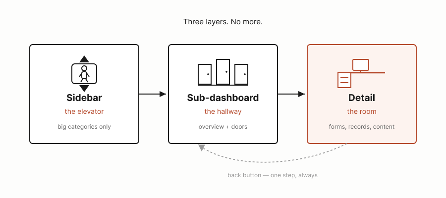
The landing dashboard is the lobby. The side menu is the elevator — it takes you to a floor, and each floor is a category. Step off the elevator and you’re in a hallway: this is the sub-dashboard. You can see doors from here, grouped and labeled with door plates, so you know what’s behind each one before you open it. Walk through a door and you’re in a room — the detail layer, where the actual forms and content live. From any room, the back button takes you straight to the hallway, and from the hallway you can reach any other rooms.
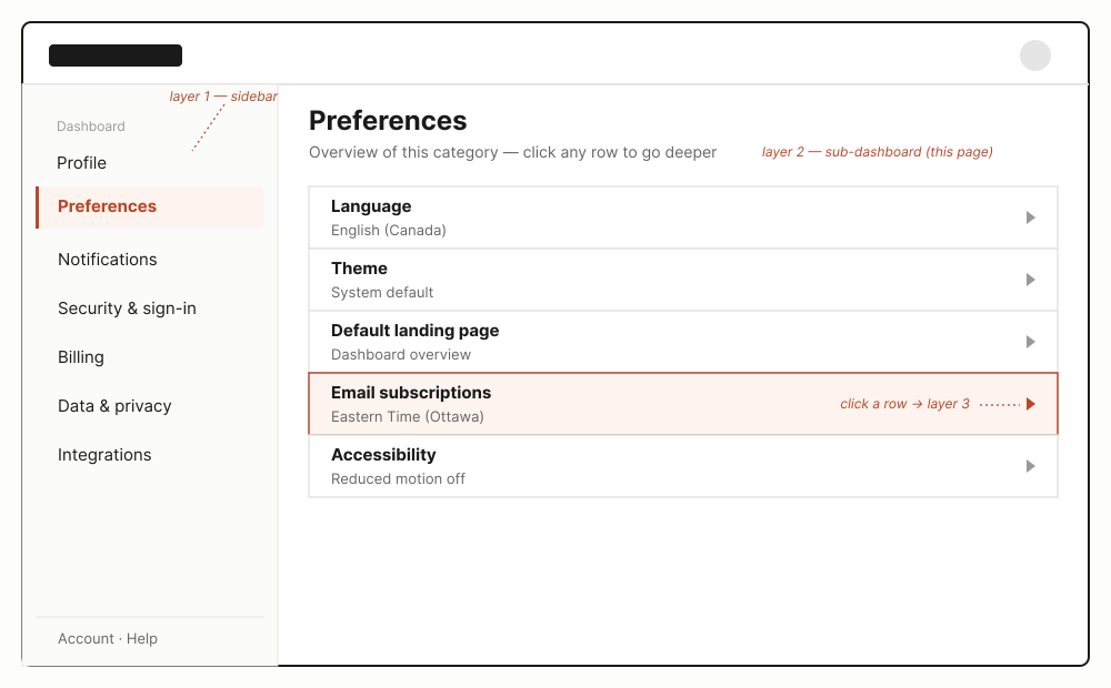
No matter how deep someone goes, they’re never more than one step from an overview, and never more than two steps from anywhere else in the building.
Why flat wins: scan-ability and scalability
This structure earns its keep in two different directions, for two different people.
Scan-ability is for the end user. Someone stepping off the elevator should know where to go at a glance — the hallway shows them the whole floor at once, grouped and labeled, instead of forcing them to guess which nested menu hides what they need.
Scalability is for the team building the product. Because the sub-dashboard is just a hallway of doors, you can add a door, remove one — without touching the elevator or the building’s structure at all. That’s the actual test of whether an information architecture is any good: can you keep adding rooms for years without ever needing to redesign the floors.
Most nav problems I’ve seen aren’t nav problems. They’re a team that let the elevator grow extra buttons because nobody designed a hallway.
When three isn’t enough
Occasionally a sub-dashboard has too much inside it to stay flat — a category grows until it needs its own categories. When that happens, I don’t bolt on a fourth or fifth layer with its own new rules. I repeat the same three-layer pattern one level down: the floor becomes its own small building, with its own elevator, hallway, and rooms.
That keeps the pattern consistent for users no matter how deep the underlying complexity gets — they’re never learning a new shape — floor, hallway, and rooms always work the same way.

There’s a name for this in mathematics: self-similarity, the core idea behind fractals — a shape that repeats its own structure at a scale you zoom into. A tree works this way: seen as a whole, it’s an overwhelming tangle of thousands of forks, but zoom into any single fork and it’s simple, familiar, easy to read — because it’s just the same branching pattern, repeating.
The real test: ask a user, and they can’t tell you
Here’s how you know the structure actually worked: if you ask a user to describe the structure, they won’t be able to. They won’t say “there are three layers, a side menu, a sub-dashboard, and a detail view.” Most people have never consciously noticed a navigation system in their life.
What they will tell you is that they always know where they are, where to go, and how to get back. It is automatic — sitting in their sub-conscious, not their working memory. A good navigation system doesn’t teach users its structure. It disappears into one, so completely that people stop noticing it’s there at all.
There’s a reason this shape feels invisible rather than learned: category, then overview, then detail is close to how people already sort the world in their heads. Nobody processes a new place detail-first. We categorize first, get an overview of what’s in the category, and only then look at specifics. The three-layer pattern doesn’t teach the brain a new trick — it just uses the one it already has.
This isn’t a new idea
You’ve likely used a version of this pattern today without noticing — that’s rather the point. Open Google’s account management settings and the shape is right there: a flat sidebar of categories (Personal Info, Security & Sign-in, Data & Privacy, and so on), no nesting inside it. Click into one, like Personal Info, and you land on a sub-dashboard — a flat list of fields with their current values shown inline, still no sub-menu wedged in between. Click a single field and you’re editing just that one thing.
Sidebar, sub-dashboard, detail. Three layers, no more, on a product with a genuinely enormous number of settings to organize. If Google can keep account management flat, “too many features to keep it simple” is rarely the real constraint — it’s usually that nobody enforced the discipline early enough.